Party Assistant

A personal assistant for people to make their ad hoc social events easily and effectively.

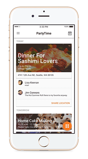
Project Introduction

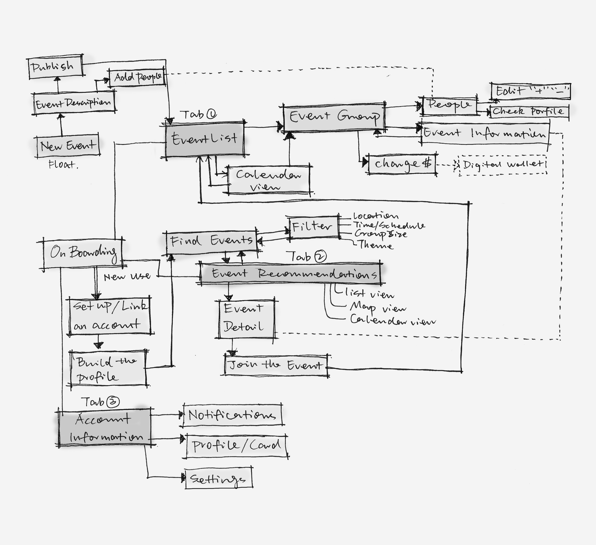
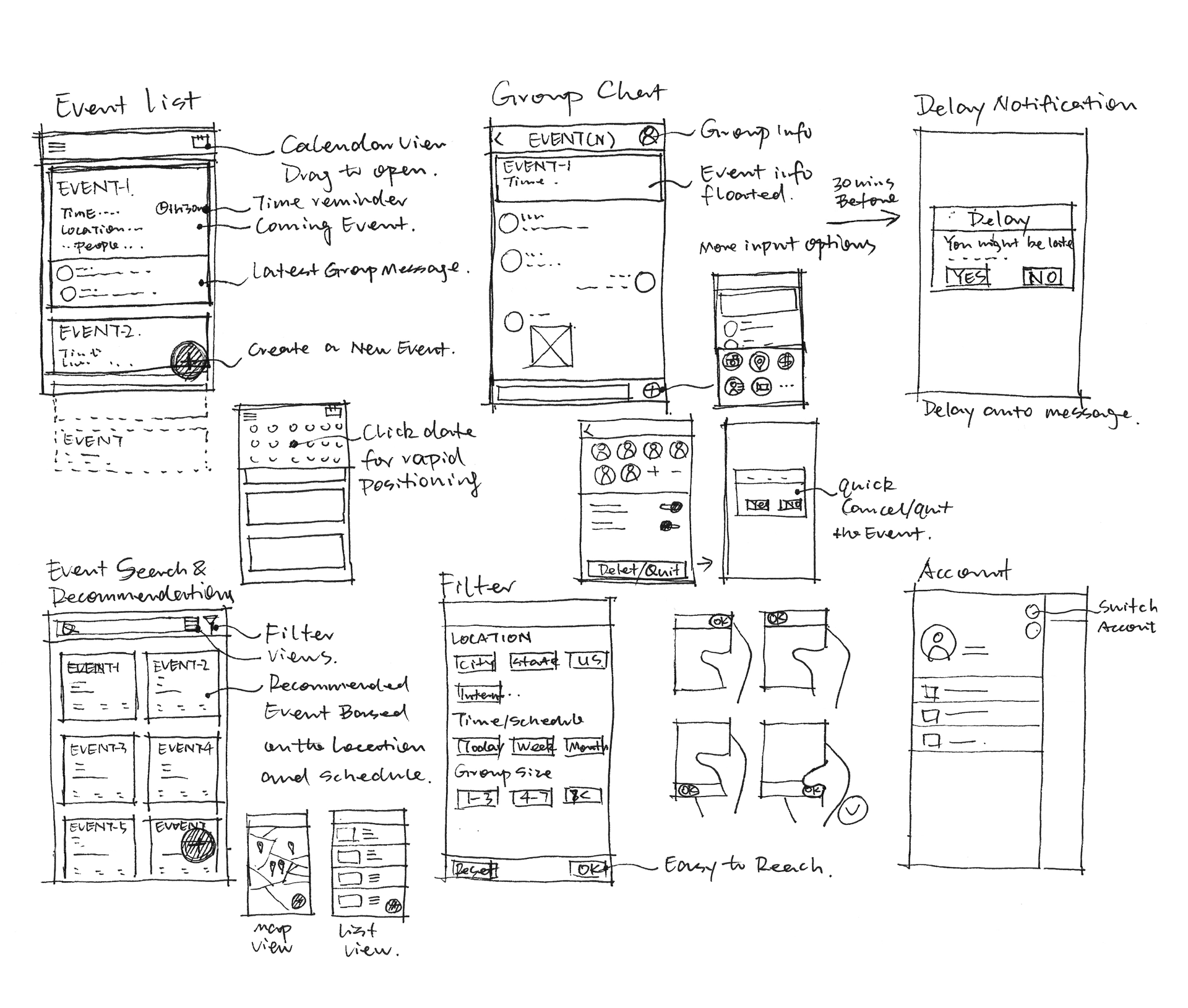
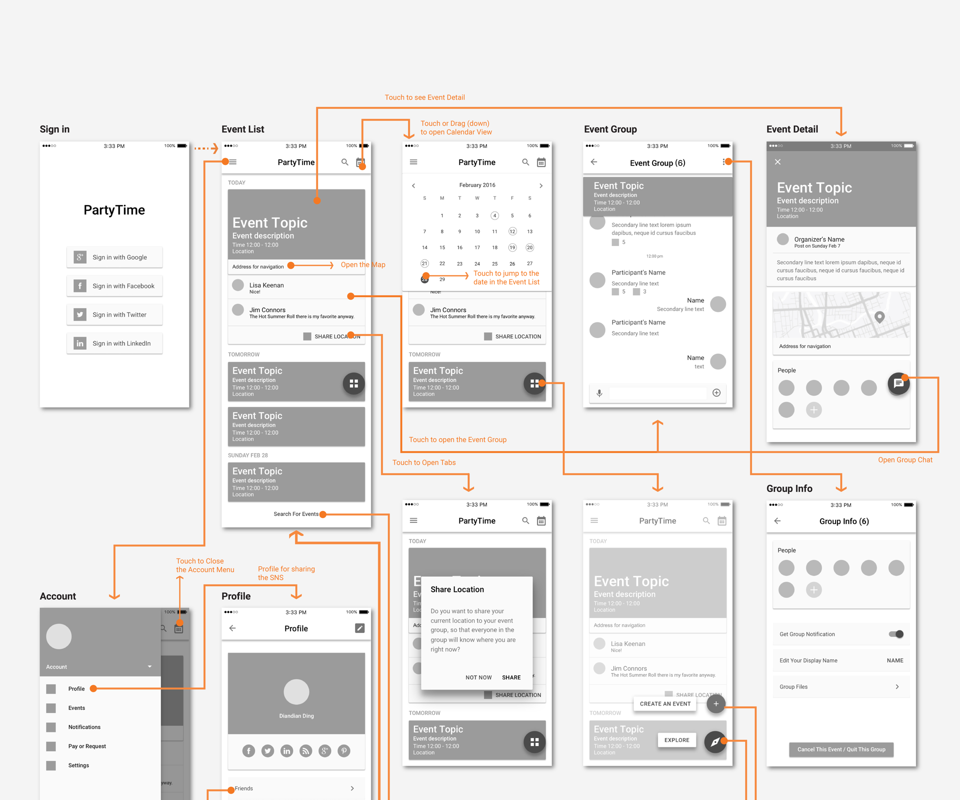
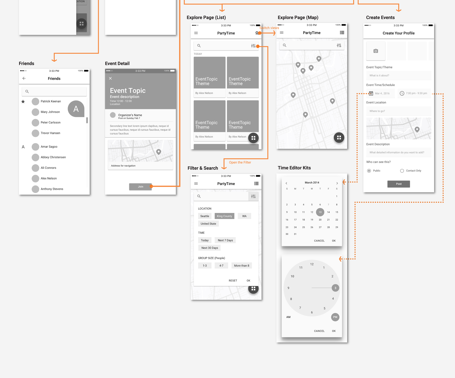
The project shows a quick design development process of a given topic which is “a party assistant”. The whole process started with the understanding and scoping of the topic. By following the brief secondary research, brainstorm, storyboard phases, the basic product interaction model, wireframe and simple prototype were developed and built.

Time spent: Research and Ideation (1 hour); Sketch and Idea Development (2 hours); Wireframe (2 hours); Prototyping (2 hours); Website (1 hour). Total is around 8 hours.

Secondary Research

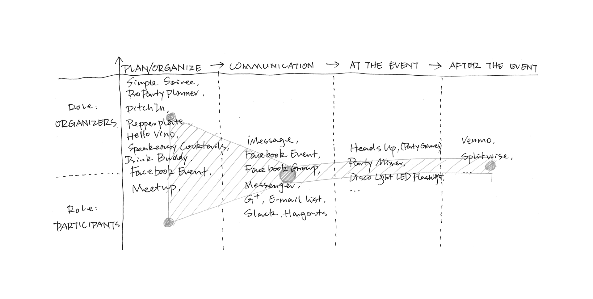
There is no dominated product focusing on the ad hoc event management right now. But many products hits this markets from different perspectives. For example, people might announce their events on Facebook Event and ask friends to join, share the Google calendars about the event to attendees through email list. As the attendees, they might visit Meetup to look for events they interested in, or join the events announced in groups. Then, they have many choices to communicate with the relevant people or certain group. But most of them would move to another platform for chatting. There are also some other issues need to think of such as the money transfer. For some scenarios, attendees need to pay the shared expenses to organizers. Young people might prefer to use Venmo for sharing expense.

The whole process should be considered as a whole, but the product should be light. The scoped design question is: How could the assistant help people with a better time management of the interested ad hoc events and how could the assistant provide a better communication platform with relevant people through the event?

Brainstorm and Mindmap

As mentioned before, the product will focus on the event management and group communication. There are various needs for different stages (such as event planning, communication, right before the event, during the event, after the event) based on different roles (The role of organizer and attendee / participant). The needs and restraints form the basic functionality of the product.

Storyboard

Sitemap

By organizing the overall functionalities and features, the structure and the basic workflow has been developed. Generally it contains three initial parts: the Events Management, the Event Exploration and the Account Management. The event group are based on each event which under the Event Management. As the participants, the Event Exploration is for people to seek interested events. A floating button for organizers to publish new events in both the Event Management parts and the Event Exploration parts. Profile and friends management are belonging to the Account Management section.

Wireframe

An event list based on the timeline will be the basic structure for the Event Management part. As the storyboard shows, the communication would become very “dense” at the “Right Before the Event” stage. When the IM based event group getting very active right before the event, some important information such as the schedule and location change might not be easy to find. So, the event information or the updated group announcement will be always floating in the message screen. At the same time, the nearest event information, location for navigation and latest messages will be shown in user’s event list for the shortcut. Also, participants’ status might be important for others in the group, too. So a quick message button is highlighted for the location sharing to the event group. The calendar view could also help people to jump to the target date for viewing the events near that certain day.

For the Event Exploration, people are able to look for events based on their preference through the filter. Different layouts are considered from the user centered point of view.

Users will be recommended to link their SNS account within this product after they sign up with one chosen SNS account. In this way, they could easily share their SNS profile with new friends or people they wanna know during the event without typing in messages or searching on each social network platform.

Prototype

The interface was developed by following Google’s material design method. However, it was initially designed with three tabs which represent three main parts of the product instead of hamburger menu on the left. As the wireframe developed, the confliction of tabs and floating button has shown. Considering the bottom right area is the golden area on the screen and the floating leads the key interaction of it, the tab idea has been abandoned.

Reflection and Future Work

Because of the time pressure, many things could not be covered here. And there are many details in the product need to discuss and twist. For example, more design research should be designed and developed at the very beginning for a better understanding and scoping of the product and users. The detailed experience should be considered such as how people react with the messages and discussion in the group? How do people send money requests to other participants after the event? How to categorize and manage the events more efficiently? How to design the filter more user friendly and effective? Last but not least, usability testing should be done for the iteration of the design.

Other Projects You May Want to View