A tablet version of Canvas (iOS) for helping students with a better learning experience.
Project Introduction
As one of the largest learning management system (LMS) in the world, Canvas provides a platform for teachers and students to save their time and effort during the teaching and learning process. Since we moved from desktop into mobile era, people hope to do more things via our smartphones and tablets. However, the current tablet product of Canvas is not as desirable as people hoped. So, a new tablet version of Canvas (iOS app for student) has been designed in this project in order to help students gaining a more efficient study experience during the class.
Investigation
In order to evaluate the current product and understand user’s needs, multiple research method have been applied.
Survey Analysis
Rich data regarding users, goals, frustrations and needs are found in the LMS survey results. After examining the data, some related noteworthy items and patterns are surfaced.
SME Interview
Tyler is a subject matter expert (SME) with a wealth of data related to university member's needs and behaviors while using the UW LMS. Takeaways are documented after the one hour long conversation with Tyler.
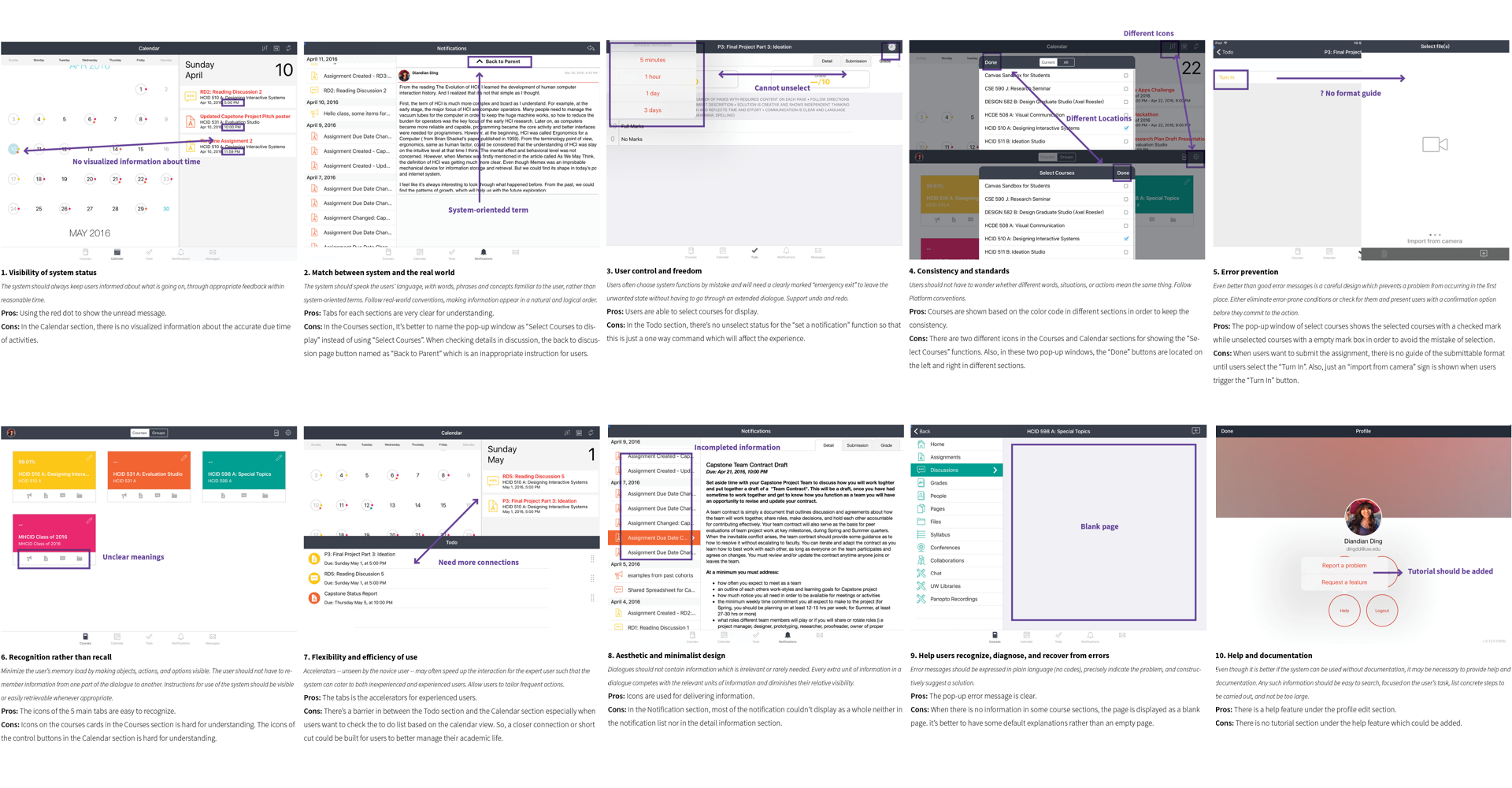
Heuristic Evaluation
By following Nielsen’s 10 principles, a heuristic analysis has been completed for the current iOS version of Canvas application.
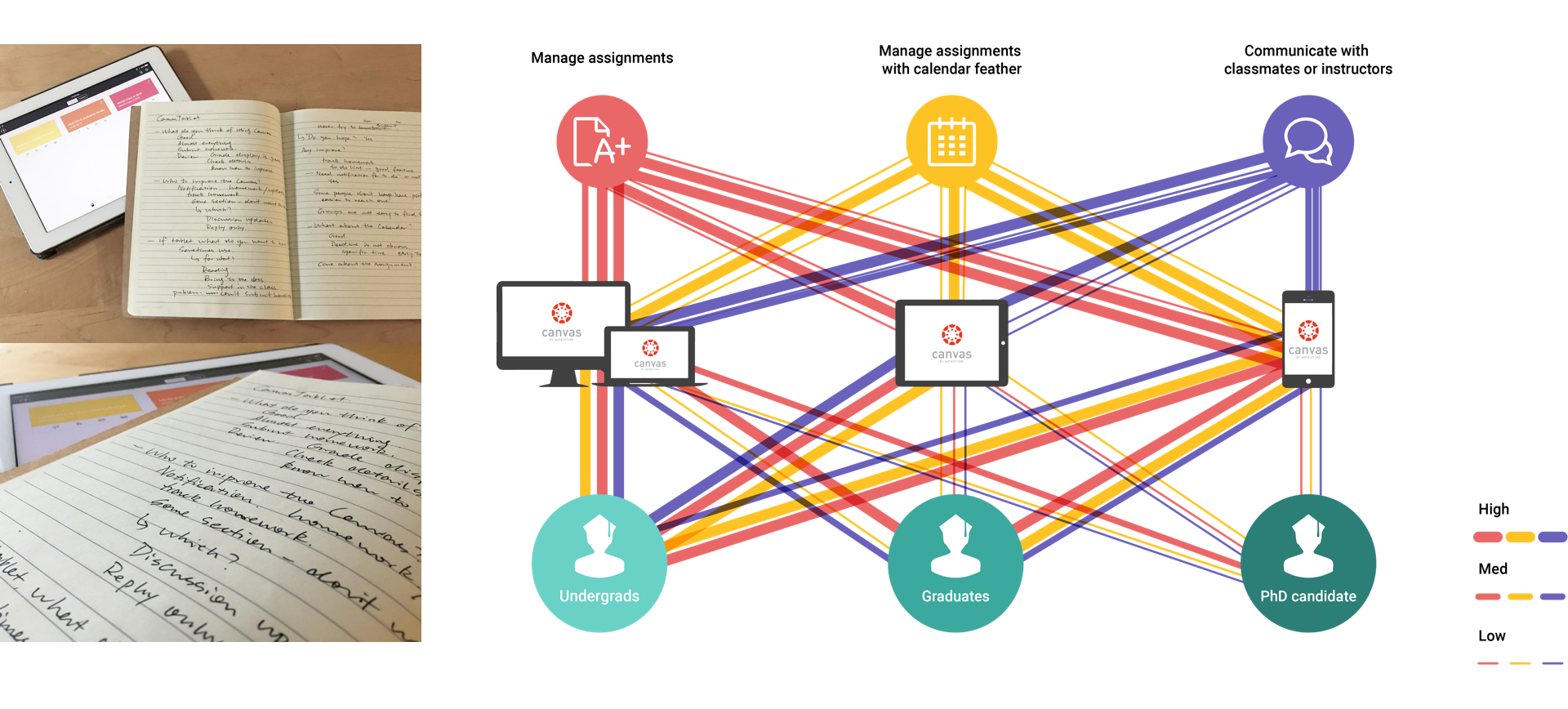
User Interview and analysis
After the first round of user interviews, a user task matrix has been made based on the the findings from the interview. Also, an experience map is created based on the activities of instructor and student roles during an assignment circle.
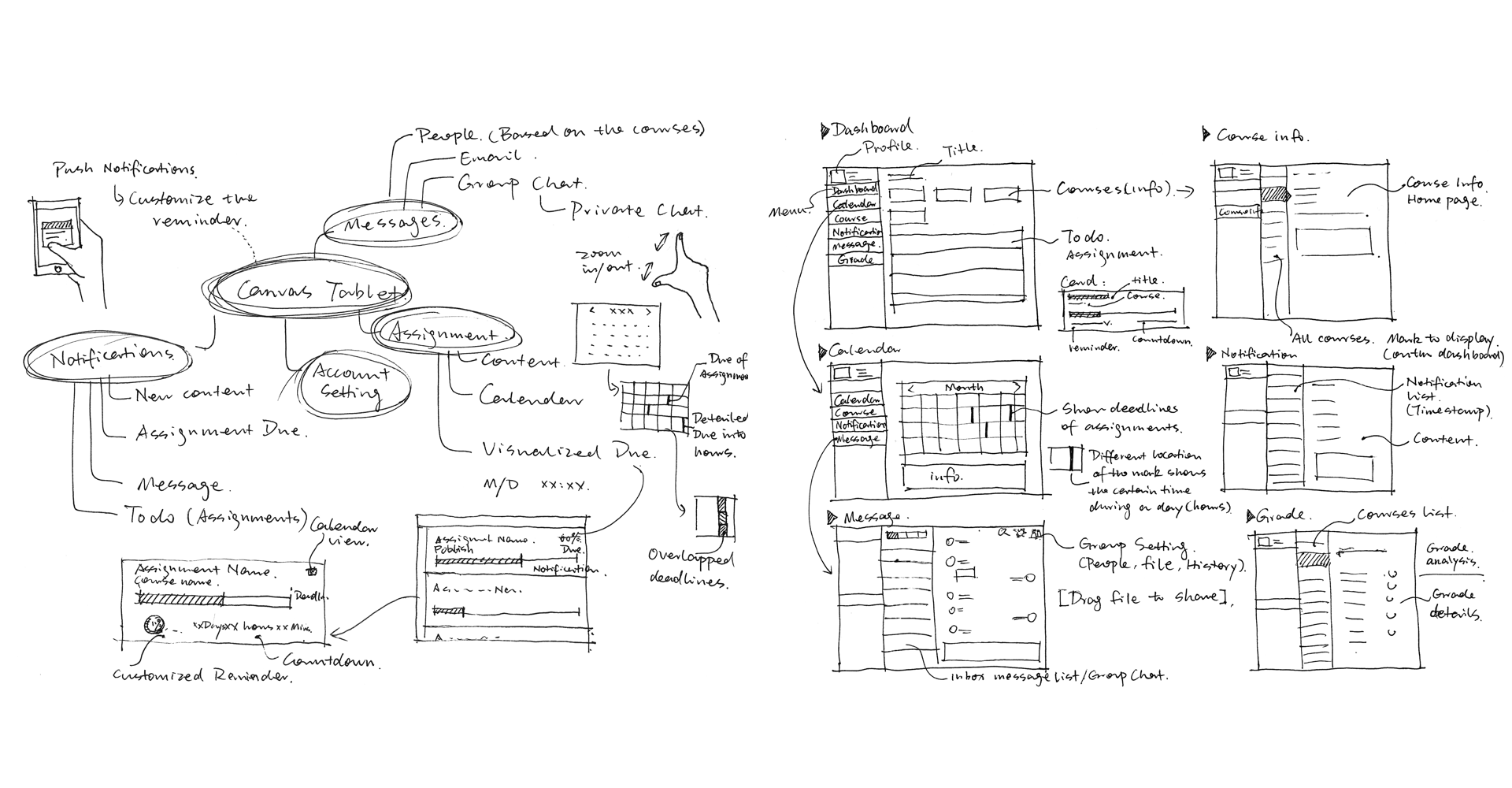
Ideation
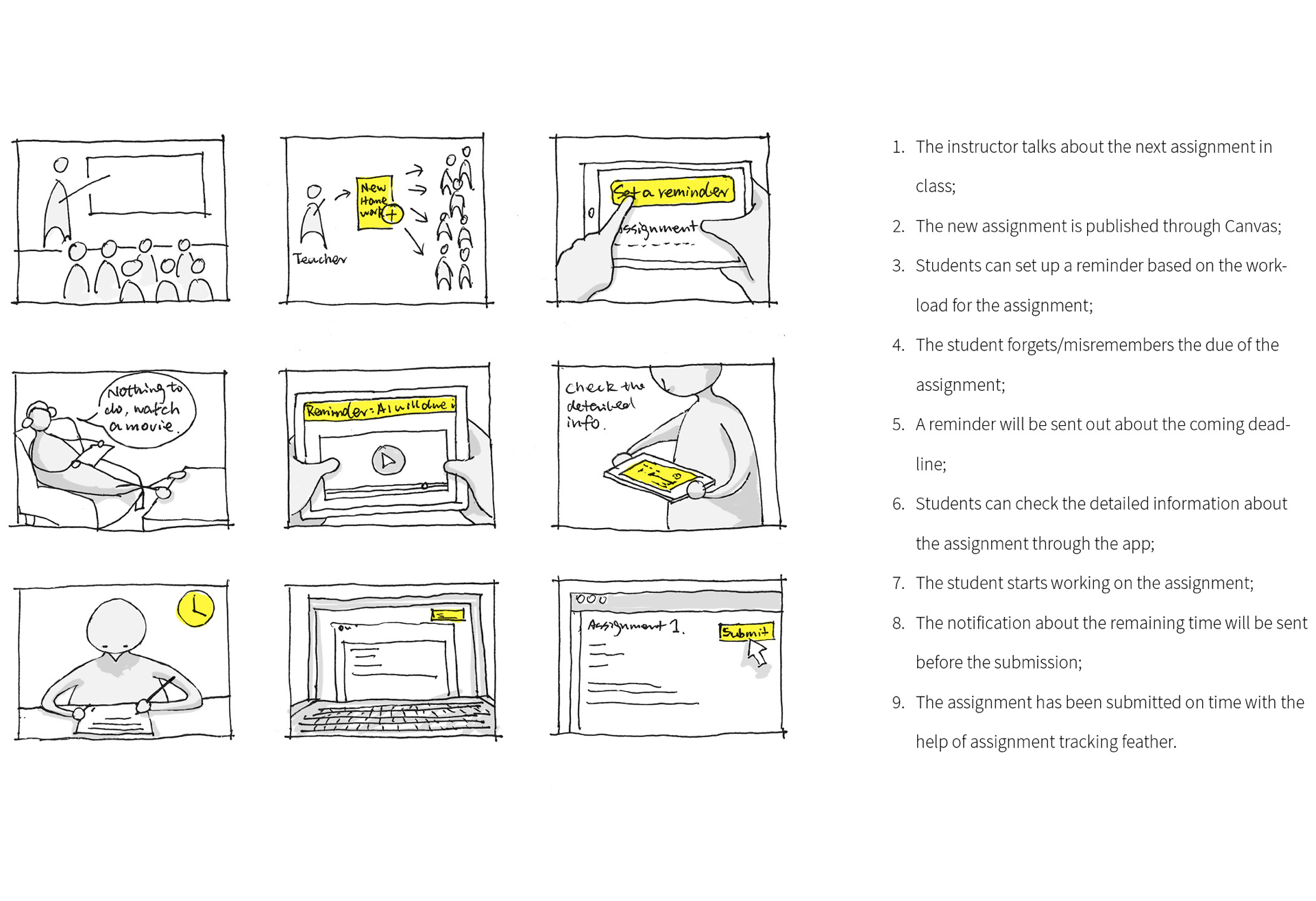
From macro to micro, the ideation phase starts from the general solution to the more specific solution. Firstly, a storyboard has been used to show the experience of a student when he receives an assignment.
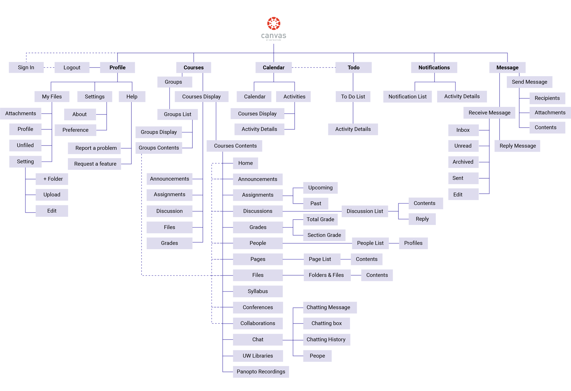
A new sitemap has been refined based on the current struction.
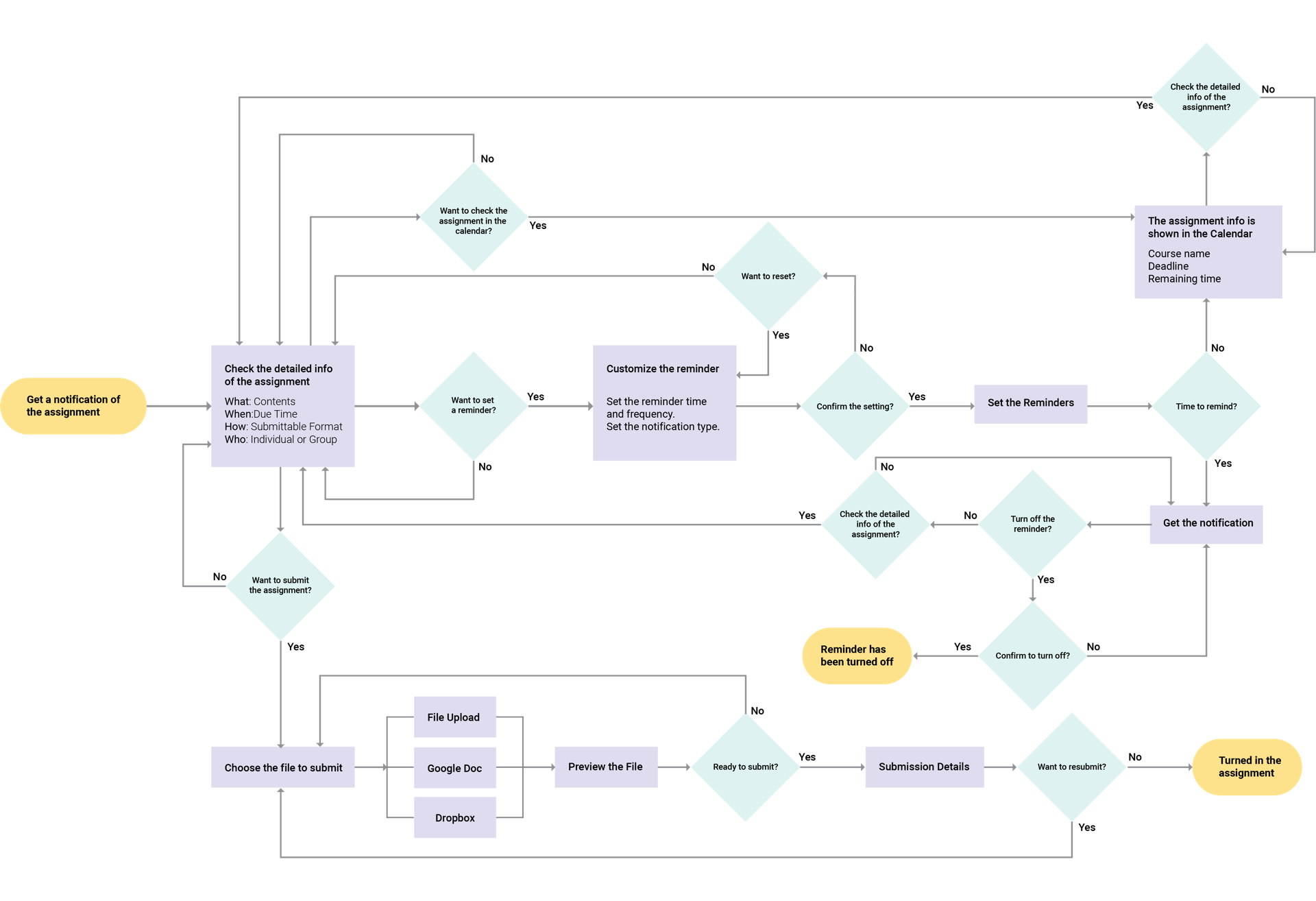
More detailed interaction model and interfaces are sketched.
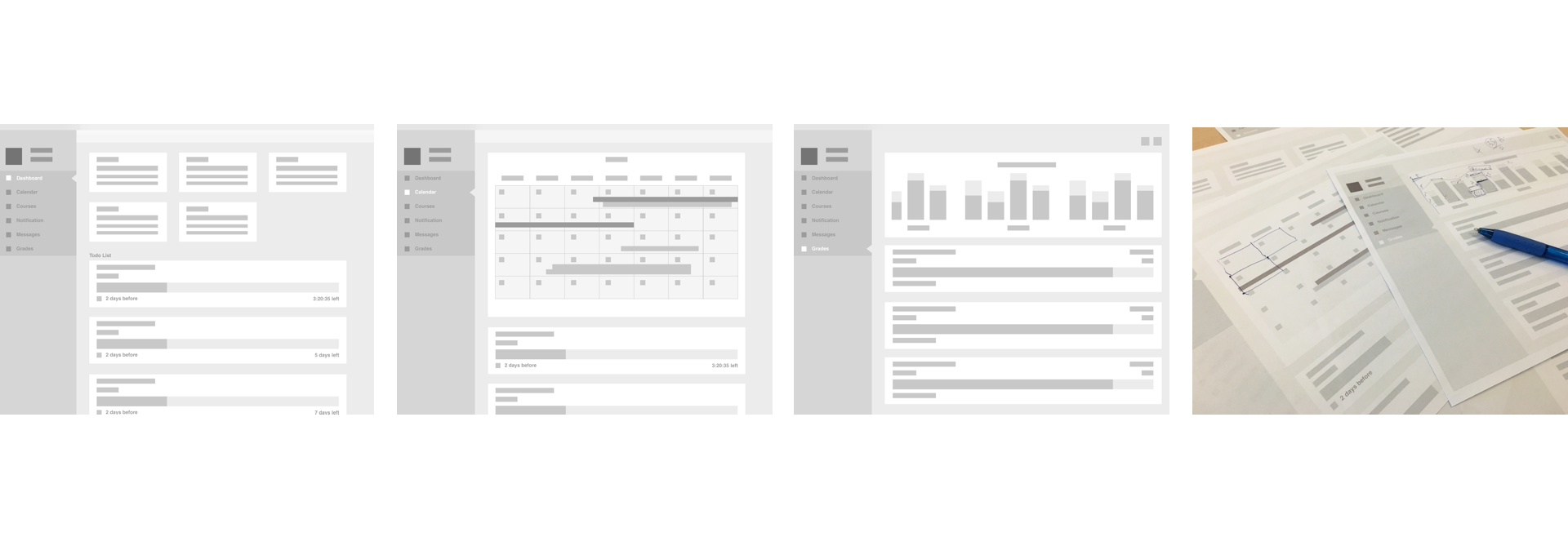
Wireframe Evaluation
A series of low-fidelity wireframes are created. There are several major changes of this iteration.
Todo list is shown at the dashboard and customized notification function is provided.
Visualized calendar is used to show assignment status.
Grades information is shown in the navigation bar and detailed data is visualized in Grades section.
Instant message replaces the email inbox function.
There are some key findings from the guerrilla testing:
Calendar has the highest priority.
Some repeated and unnecessary information needs to be simplified.
Grades should be visualized more clear.
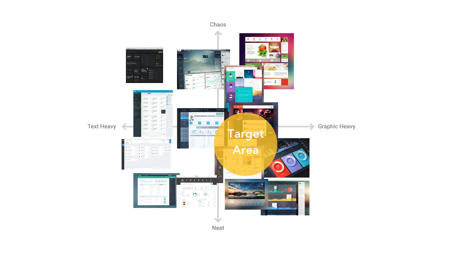
Style Analysis
A two by two matrix has been made to show the result of UI style research. Also, based on the heuristic evaluation method used before, interface style decision has been made. The new design will still follow the color code method of the current version in order to provide a clear clue of courses. Besides that. monochrome color theme will be used for the general display.
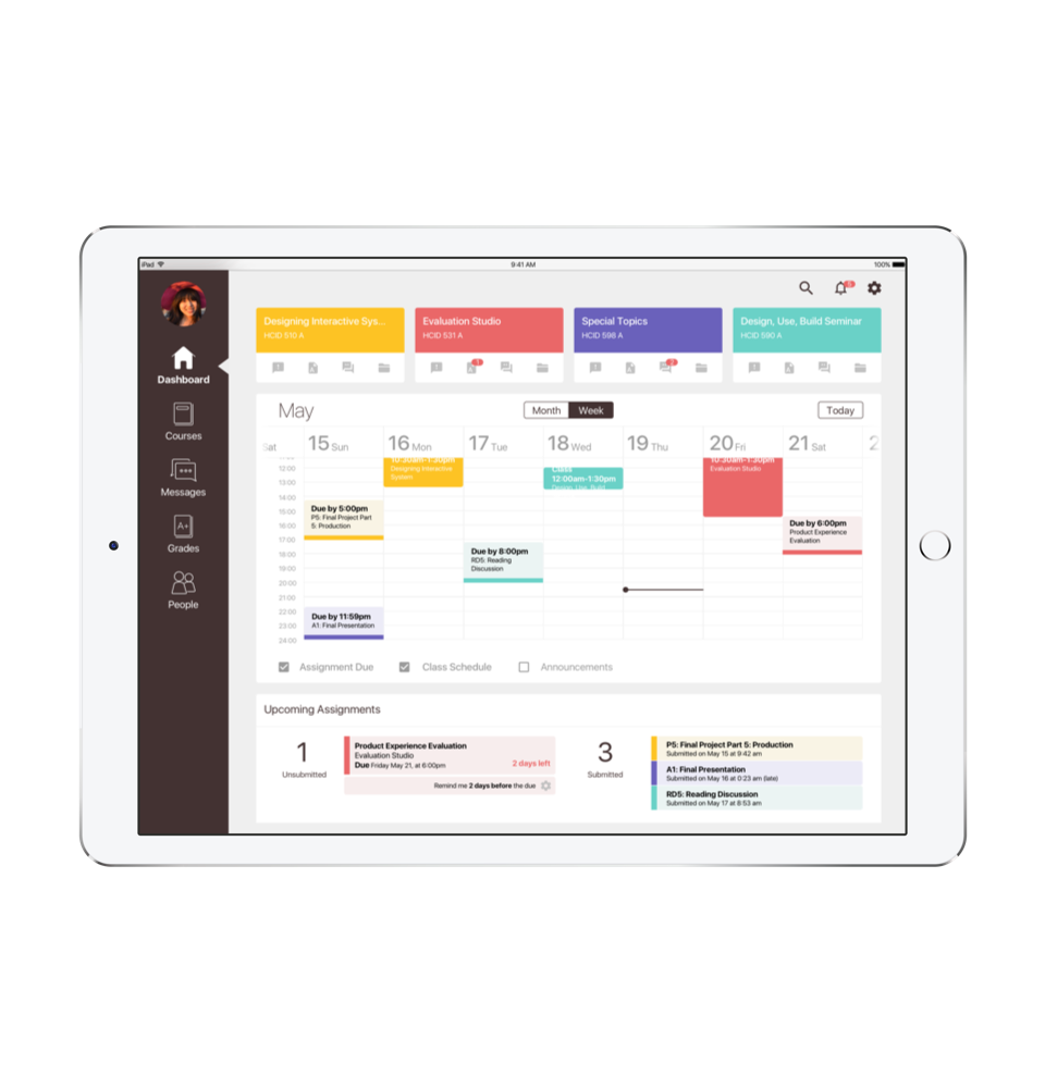
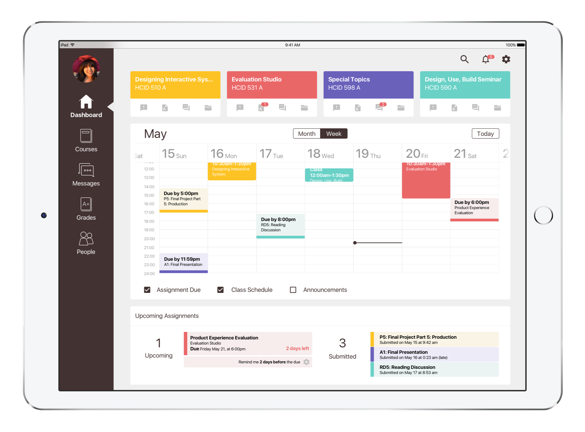
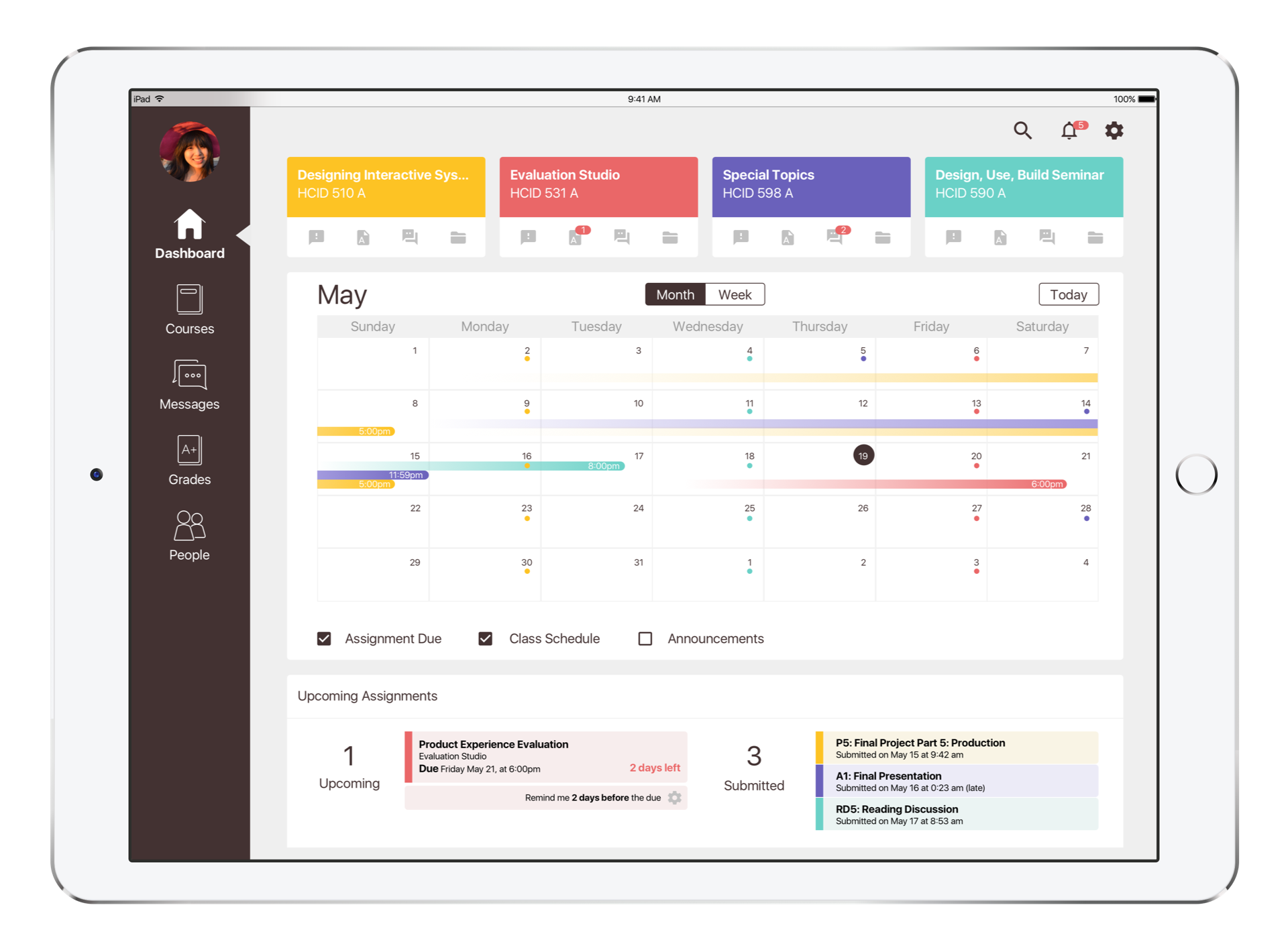
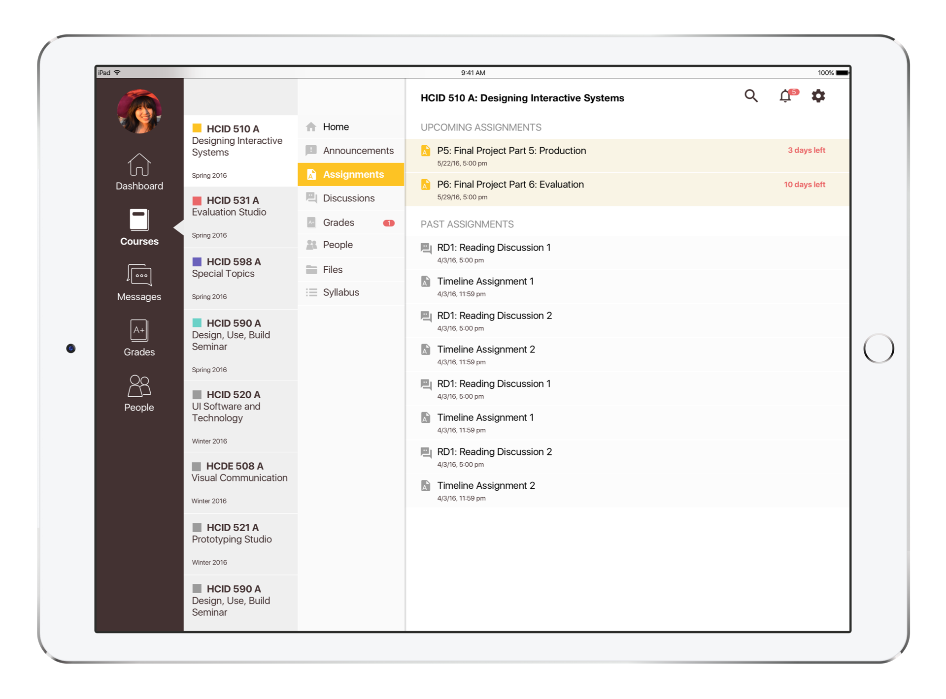
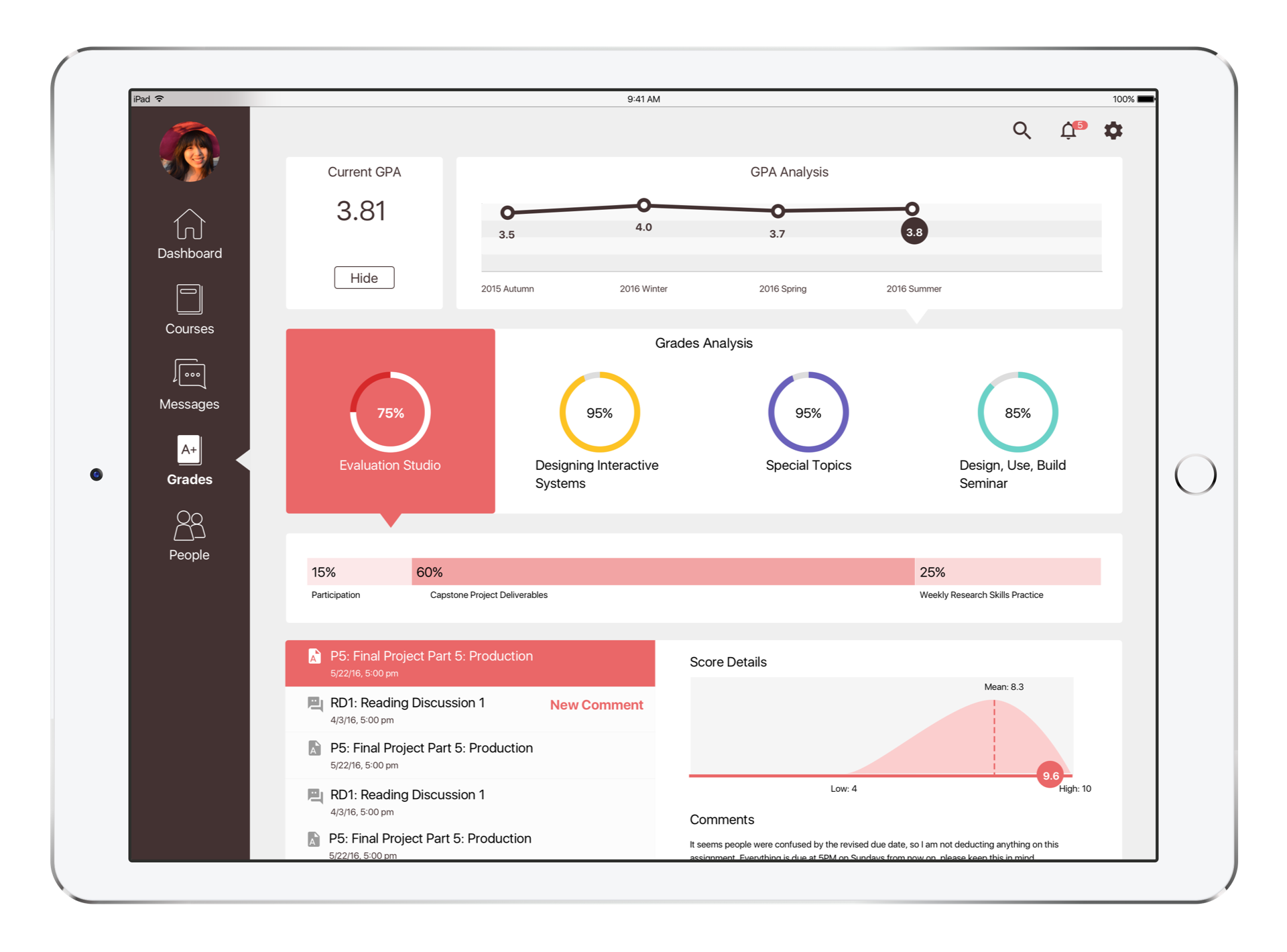
High Fidelity Prototype
Based on the feedback from last round test, some changes have been made for this iteration:
Calendar: Week view (as the primary display) and month view are provided in calendar; Tabs are available to switch views; Click “Today” to go back to present.
Calendar Week View: Scroll the date row left and right to see more days; Scroll the timestamp column up and down to see the whole day activities; Present line is always shown; People are able to choose the information shown in calendar by selection.
Upcoming Assignment: Upcoming and submitted numbers of assignments are shown; The up-to-date countdown of due for each assignment is shown; People are able to customize the deadline reminder for each upcoming assignment.
For Courses section, all registered courses are shown in the course list by each quarter, but only selected courses will be highlighted with colors; new information notifications have been added.
The customized GPA analysis has been added for the quick review. Visualized grade analytics and grading comments are also provided.